
In 1969 a group of scientists from the Massachusetts Institute of Technology went out and did a bunch of measurements like this. They looked at the variation in z0 and U* as functions of U10, the air speed 10 m above the ocean surface. They took 299 separate wind speed profiles, binned by U10 like so:

From which they got the following graph for U* vs U10 :

And the following graph for z0 vs U10:

Now, the values in Fig. 3 and Fig. 2 come from the slope and intercept, respectively, of equation (1) fitted to the same data. So I don't know why they didn't put error bars on this second graph or why they drew such a wacky line through the data points, since they didn't have Excel with 'draw a stupid non-physical line through the points' as a default option.
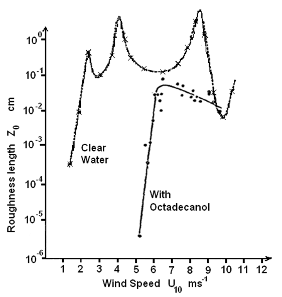
Paper 2: When they were sailing near Block Island this same group of scientists also did some more experiments where they poured oil on troubled water and took the same measurements, which they reported in another paper. This paper only has a graph for z0 vs U10:

And here they have only shown the trend line for the non-oil data because this paper was concentrating on explaining the oil data. They explained the difference between the oil data and the non-oil data using one model and not long afterward another scientist put out a paper (in Science, so no slouch of a paper) giving a different explanation for the difference.
Paper 3 (Science): The data presented in this paper (and cited as coming from Paper 2) looked like this:

 Note that the data points that are from Paper 2 are exactly the same, but the data points that are not actually shown in Paper 2 (and are presumably from Paper 1) have wobbled around quite a bit. Paper 3 doesn't say so, but it is possible that all the points in these two plots that aren't the published points from Paper 2 come from the data used in Paper 2 but not shown (and hence for the no-oil curve, the same as Paper 1) Note that the positions of the open circles in the open circles in the z0 graph are actually quite different between Paper 1 and Paper 3, which suggests to me that the author of Paper 3 got hold of the raw U(z) plots for Paper 1 and re-fit them to the first equation we thought of.
Paper 4: Now for the fun part. This is from a much more recent review paper.
Exhibit 1:
This is cited as being 'after Paper 1 and Paper 2'. Sure enough, it is the data from Paper 2. But it isn't the data from Paper 1. It's the silly fitted line shown in Paper 2 with spurious data points added in crayon! How lame is that?
Exhibit 2:

This is reported as being 'data collected by [author of Paper 3] (after Paper 3)', as if it is a totally independent experiment!
...
This sort of thing could have been avoided if people in earlier decades had the ability to scan papers they were interested in and cut and paste bits of screenshots of them, like I've been doing.
FWIW this is what I reckon the curves should look like, drawn on the figures sourced from Paper 3 as they appear in Paper 4 - suspect points flagged from having big error bars and lying way off the U* trend-line as reported in Paper 1:
